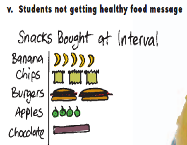
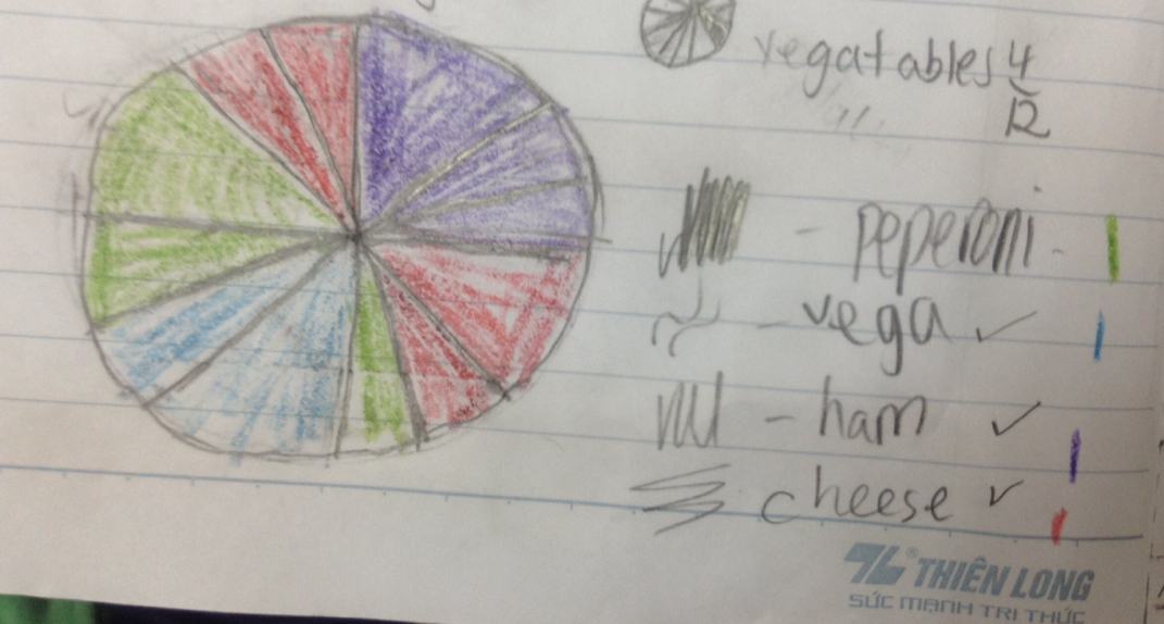
- Explain any flaws do you notice? Do you see any missing information, misleading information, or confusing information? What makes it a flaw or wrong?
- Title is not clear and mislabeling
- I think this type of graph doesn't fit the data
- IF we count all together I think there is only 15 people who went or bought something. So maybe we need a key of some sort.
- There is no labels.
- Not enough people.
Maybe the graph have these flaws because maybe a little kid made it. We don't know the truth. So maybe he doesn't know much about graphs and labeling. So, I think that a little kid made it.
3. What changes would you make so the graph CLEARLY and HONESTLY represents the data.
In my opinion, I would like to change the type of graph. I am not sure what type of graph this is but I think we should make a bar graph. I think the bar graph fits this data more than this type of graph. so, I think that we should change the type of graph like the bar graph. I also think this graph should have a key. I don't think that only 15 people went to the interval and ate some food. So, I think there is a key and they teach us about how many kids is one apple. I think they should also change the title because the current title is called students not getting healthy food message. I think it doesn't fit the data that has been given to us. I also think that there should be more labels around the graph.


 RSS Feed
